Having worked in different industries and organizations, I've been fortunate to try my hand in several different projects
Most recently with Discount Tire, I've worked primarily with A/B Testing, UserTesting and analytics
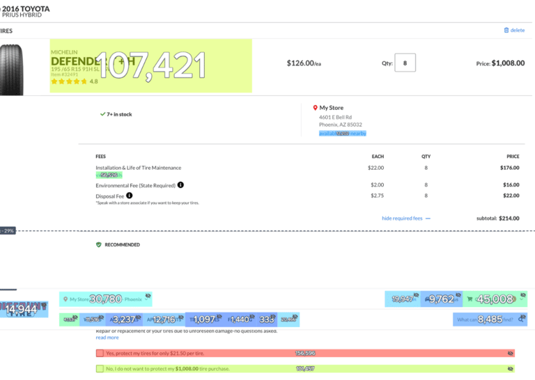
While reviewing analytics on our checkout page, I noticed something alarming that would go on to prove to be a successful test
When users are about to checkout, I saw that there was a huge portion of them who were trying to click on the actual product one more time before checking out. This is represented in the graphic on the right by the fact that we have 107,421 clicks on the product itself (which wasn't clickable), and only 45,008 clicks on checkout
This sparks my idea that users want one last validation check before purchasing such an expensive product, similar to how you're able to on Amazon. In order to be sure, we conducted a multivariant analysis accompanied with insights from UserTesting
While the user testing was being conducted, some of the questions asked were:
How would you describe your knowledge and understanding of tires overall?
How do you feel about the amount of information presented at checkout?
Is there anything that would prevent you from moving forward with ordering these products?
How confident do you feel about your selections once you've reached checkout?
In order to best identify and correct the issue, three variants were tested:
Default Experience - no change and user cannot validate product
Return to product page - clicking on the product takes you back
Modal pop up - on top of current checkout page with valid info
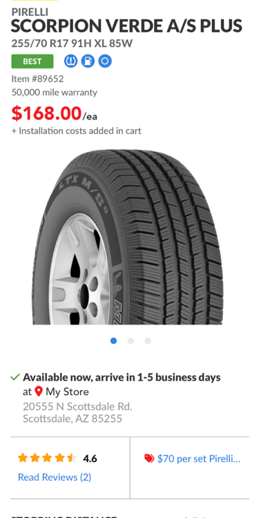
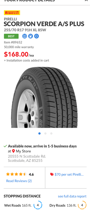
It took about a month and a half to reach statistical significance, but after the multivariant test, coupled with user testing, variant three (pictured on the right) was determined to be the best overall experience on all fronts

In addition to these metrics, our NPS score for the checkout page rose almost 25% the month following this test, which proves that aside from generating more revenue, we also increased customer satisfaction
Frustration at Checkout
I've ran dozens of tests, some of which proved successful...
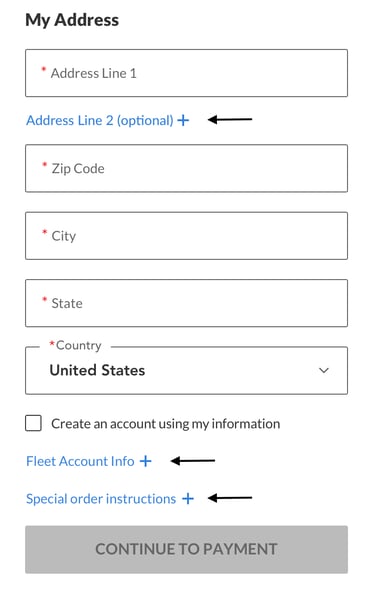
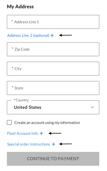
While auditing the site, I realized we had several unnecessary steps that remained visible to users at all times. I had a simple idea to test removing these optional fields at checkout and only display ones that were required. While this test stems from a simple idea, the results were completely unexpected. This test generated:
5.05% more Conversion
10.56% lift in revenue
8.06% lift in transactions completed
and has an annualized revenue of $11,326,786!
then there are tests that generate no, or negative results

⮕
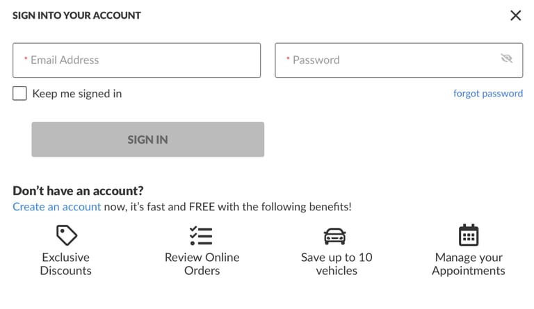
To encourage more account creations and therefore conversions, I wanted to add the benefits of creating an account with our company. When we decided to end this test, the variant proved to not elicit any meaningful changes in the experience. It's important here, though, to not say this is a "loser". What is important is being able to take meaningful findings from this test, revisit the original problem, and tackle new ways to solve the issue
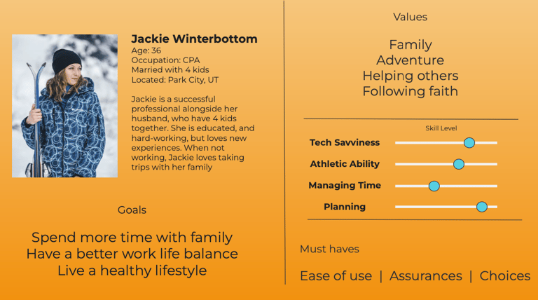
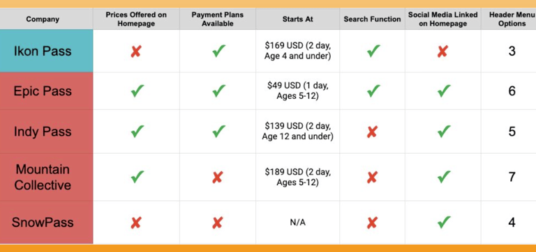
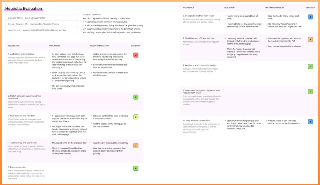
In addition to these, I also have examples that include: Competitive Analysis, Heuristic Analysis, Site Audits, and User Personas
